Your Post Production Partner
Streamline. Enhance. Excel.

Streamline. Enhance. Excel.
Streamline. Enhance. Excel.

Let's talk about color. Seems simple, right? We all know red from blue, and most of us can spot the difference between forest green and sage. But here's the thing – when you're shopping for a $3,000 handbag or a designer watch online, "close enough" isn't good enough.
I recently had a chat with a luxury brand manager who told me a story that might sound familiar. Their newest collection of leather bags looked stunning in person – a perfect shade of camel brown that practically sold itself in their boutiques. But online? Customers were returning them in droves, complaining the color looked "completely different" on their doorstep than it did on their screens.
This isn't just about disappointed customers. It's about brand trust, reputation, and yes – the bottom line.
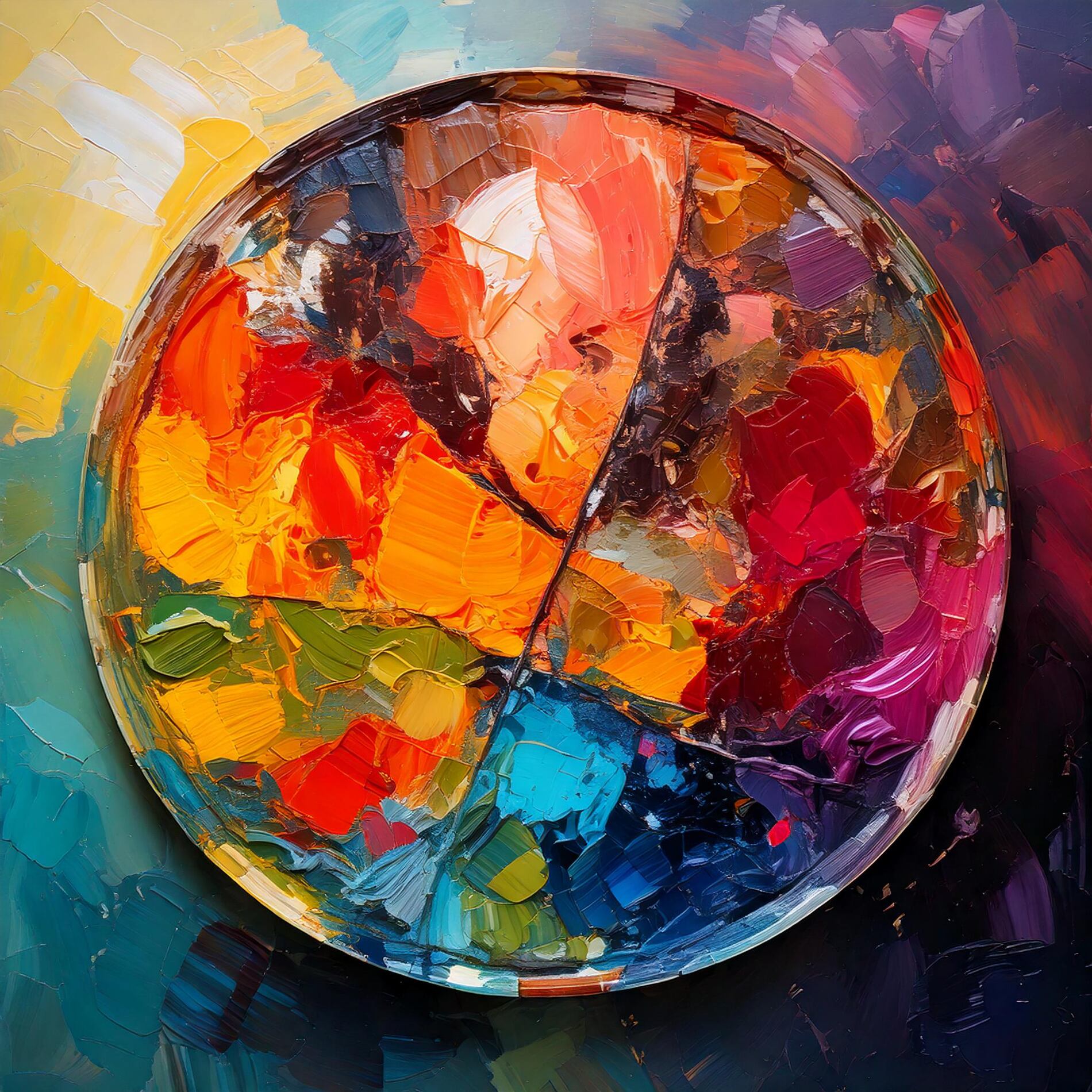
Here's where we need to get a bit nerdy – but stick with me, because this matters. Most photo editing services work exclusively in RGB color space because, well, it's easier. It's like painting with a basic set of watercolors. You can make nice pictures, sure, but try matching that exact shade of Hermès orange or Tiffany blue.
At Sam the Postman, we dive deeper. We work across multiple color spaces (think of it as having access to every paint shade ever created):
• sRGB for web display
• Adobe RGB for those tricky luxury goods colors
• LAB color when we need surgical precision
Let me share a recent win. We worked with a luxury fashion brand (you'd know the name, but we'll keep it quiet) that was struggling with returns. Their problem? Online photos that didn't quite capture their signature colors. After implementing our color management system:
• Their color-related returns dropped by almost half
• Customer satisfaction shot up
• Their social media engagement improved because their products finally looked consistent across all platforms
What makes us different? It's not just about having fancy equipment (though our color calibration tools cost more than a small car). It's about understanding that every material reflects light differently. A silk scarf needs different treatment than a leather wallet. Metal watches need their own approach entirely.
We've developed specific processes for:
• Fine jewelry and watches (those tricky reflections!)
• Leather goods (capturing that perfect patina)
• Textiles (showing texture while maintaining color accuracy)
• Metals (getting the right shine without losing color fidelity)
Look, premium color management isn't cheap. We won't pretend it is. But here's what costs more:
• Dealing with returns because "this isn't the color I ordered"
• Losing customer trust
• Watching your luxury brand's reputation take hits on social media
• Training customer service staff to handle color complaints
You might be wondering if all this really matters for your brand. Ask yourself:
• Do your products have signature colors that need to be spot-on?
• Are you tired of explaining to customers why something looks different in person?
• Does your brand compete in a space where details matter?
• Are returns eating into your profits?
Here's an idea – send us one of your challenging product photos. We'll show you what our obsession with color accuracy can do for your brand. No strings attached, just pure color perfection.
Because at Sam the Postman, we believe that when it comes to color, close enough isn't good enough.
Ready to see your products in their true colors? Let's talk.
© 2023 SAM. All rights reserved


